Political party colours and Ghana’s 2020 election: The NPP in context
 Colours have been part of political and social movements throughout history
Conventional knowledge holds that voter choices are as a result of party affiliation; the position on the most controversial policies of the day; evaluation of the incumbent on valence issues like the economy, education, security among others. In recent times, burgeoning literature is opening up and paying attention to other indicators of voter choices in elections: gender, temperaments, fame and influence, social media, communication, style of leadership, even fashion and appearances. How good you look can determine how successful you can be in an election or a course especially if you are not very popular. Maybe this is one of the charms Dr Mahmoud ‘Magic’ Bawumia and his beautiful wife Samira brought to the NPP. It worked! However, I focus on ‘Party Colours’ and its relevance in electoral politics, especially in Ghana’s 2020.
In October, the New Patriotic Party launched a ‘Colour campaign’ on social media. The combination of the Red, white and blue was enough to get one some good LIKES on Facebook as long as it captioned #4MoretodoMore or #4More4Nana. I loved the idea. For a moment I thought the digitalised capitalist had acquired Facebook. For days, the NPP trended with almost everyone with access to a smartphone and some love or sympathy for the NPP sharing their pictures, selfies and 4 fingers in party colours.
The above phenomenon got me thinking about the role and relevance of party colours in electoral politics.
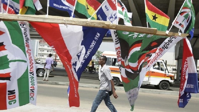
Colours have been part of political and social movements throughout history; communicating all manner of messages, depending on the time, cause, course, and culture. For example, the colour red has become the ‘go-to’ colour for radicalism agendas; adopted in highlighting those issues that require immediate attention in our national lives. Most demonstrations across the world are not complete without the use or inclusion of this emotive colour. Likewise, in Ghana, colours mean different things to different people. Red, brown, black clothing, pieces of it, depending on how they are used (worn) is a sign of mourning. Red can also evoke some warmth and make you very hungry. Interestingly, why do you think a lot of food joints and restaurant dominate this colour in their designs?
The red colour of the ‘Top 4’ political parties, since 1992, is not the same in terms of brightness; it varies from one party to another. The NPP has what can be described as the ‘original’ Red; it is intense and attractive. The NDC’s shade of red can be described as the blood-like, some believe it is Red 3 or fine brick or Cherry red; whatever shade that is- It is also very attractive but has this gloomy or dark appeal. It shares this colour with The People’s National Convention (PNC) and the Convention People’s Party (CPP) has the Rose-red [colour blindness is equally a mental condition].
In summary, the red colour present in all these flags represents the sacrifice, struggle, passion demonstrated by the founders of the various parties.
The pine-like Green colour adopted by the NDC is also more attractive than the parakeet or shamrock Green of both the PNC and CPP. Philosophically, Green would represent abundance, purity, goodness in Ghana and safety and balance in places in the United States and Europe.
For the founders of the party, it means the harmony of ideas from members at the grassroots to the executives is paramount to the decision-making of the party.
Members in the parties agree to disagree or vice-versa, to vital issues related to them. For the CPP and PNC, the green stands for the rich agricultural produce the country holds, youth development and the hope of new beginnings.
The Black as used by NDC makes a good inclusion to the colours and represents national pride; almost the same vibe exuded in the black star in the National flag.
The Blue colour by the NPP is also colourful and attractive. Blue represents calmness and in some quarters, intellect or too intelligentsia (almost bourgeois); the latter being the most dominant feature in the party’s history. It is also believed it represents the trustworthy and honest nature of the party’s leadership. The blue colour is arguably the most marketed colour of all the NPP colours in 2020. The campaign billboards, posters, the threshold design photoshops, digital wallpapers, souvenirs are mostly (if not all) designed in blue.
The colour white, like red, is used by all Top 4 parties. It is also very powerful and combines well with all the other colours present in the various flags. Politically, victory and holiness are the words being propagated by all the parties who have adopted the white colour.
Since 1992, together with the symbols: the NPP’s female elephant; the PNC’s slightly bent coconut tree, the CPP’s cockerel and the NDC’s umbrella with the head of the eagle; political party colours have branded the parties ahead of every election. It has also helped in organising and mobilising members and sympathisers especially on the grounds of party events; created a sense of belonging and helped in intentionally provoking emotions of opponents at public gatherings especially in election years.
In 2020, party colours have gotten a new role: they are fashion statement; the colour campaign launched by the NPP in October on social media may have been a party initiative to rally support but was also some virtual fashion ‘runway’ for people to display and share their creative designs with the PARTY COLOURS.
This event has a psychological potential of strongly creating and reminding the electorate of the colours of the NPP. Quoting free Encyclopedia (2006), as cited by Ehinful (2012)“if a picture is worth a thousand words, a picture with natural colours may be worth a million, memory-wise.
Psychologists have documented that lively colours do more than appeal to the senses. It also boosts memory for scenes in the natural world.” This can mean, anyone (swing social media electorate especially) who got attracted in any way to the ‘Show your NPP colour’ campaign on Facebook may have the tendency to remember the NPP colours more than others (if the party should repeat this initiative).
Again, placing this phenomenon in the framework of Malcom Gladwell’s rules in The Tipping Point, the NPP may have created a virtual epidemic to help their fortunes on December 7.
A ‘sticky message’, ‘4More to do More’ is broadcasted around by a few notable party figures (law of few ) on social media ( law of context) through an everyday lifestyle activity. Colour and dressing!
For the few days of that colour campaign, it felt safe ( not personally but by observation) to go out in the red, white, blue colour combinations without provoking opponents considering it is an election year.
This is not scientific; it is just arguments made after some observation of recent events. And, as mentioned earlier in the introduction, considerable investigation is ongoing on those weird (non-traditional) determinants of elections outcome in recent times.
If there’s any lesson here for political parties to take, they should consider initiatives, actions in these last days and future elections to make their colours, symbols stronger on the minds of electorates.
The CPP and PNC may want to consider tweaking the green in their colours, as suggested by other scholars and probably scientifically reexamine the relevance of the cockerel and coconut on their respective flags in future elections.
I will make time for that in the next piece.
The author of this article is the Producer for Touch of Class and Class Drive on Class 91.3FM.
Source: Ebenezer De-Gaulle
Trending Features

NPP needs serious reforms ahead of the 2028 general elections
11:06
Celebrating a visionary leader: The impactful life of Dr. Joseph Siaw Agyepong
15:55
Adama City: A beacon of urbanization in Ethiopia - Addis Assefa
11:48
Second chance is NOT an automatic right or entitlement
10:14
Increased funding for Ghana's School Feeding Programme is an investment in the economy, education, and health
09:25


